

Ever wondered why a stain color you loved online looks completely different on your own cabinets? The photo shows someone else's wood, finish, and lighting. A translucent stain works with the color underneath it, so choosing kitchen cabinet stain colors isn't like choosing an opaque paint.
Oak's pronounced grain can make a brown stain look textured and lively. Maple can make that same shade look quieter, but uneven absorption can create darker patches. Existing finish, sanding, and the protective clear coat also influence what you'll see.
Wood finishes remain a meaningful choice for homeowners. In the 2025 U.S. Houzz Kitchen Trends Study, 23% of renovating homeowners selected wood-toned cabinets, while 17% selected stain as their cabinet finish.
Start with the wood, not the color name. A finished sample on your cabinet door tells you more than a screen or a store display.
Espresso, ebony, walnut, Provincial, cherry, honey oak, driftwood gray, and mocha each offer a different balance of warmth, depth, and grain visibility. In Central Texas kitchens with generous daylight, pay special attention to how those undertones change from morning to evening. Start with a shade you like, then test whether your cabinets and lighting make it work.
Table of Contents
- 1. Espresso
- 2. Ebony
- 3. Walnut
- 4. Provincial
- 5. Cherry
- 6. Honey Oak (Natural Golden Stain)
- 7. Driftwood Gray (Gray Wash Stain)
- 8. Mocha (Chocolate Brown)
- 8 Kitchen Cabinet Stain Colors at a Glance
- Ready to Pick Your Stain? Test It on Your Own Cabinets
1. Espresso
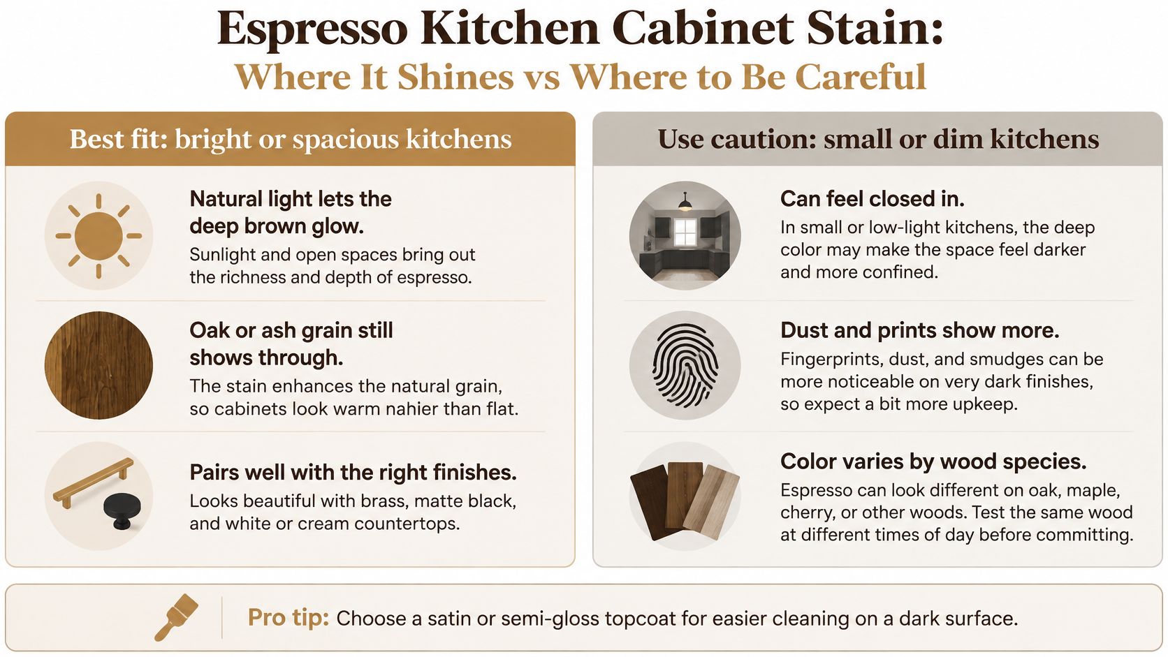
Espresso is a deep brown that can look nearly black, especially beneath countertops or in shaded corners. It's a good fit when you want strong contrast without losing every trace of wood warmth.
On oak, the darker pores and visible grain keep espresso from looking completely flat. On maple, it can appear smoother and more uniform, although uneven preparation becomes noticeable when some areas absorb more color than others.
For a practical pairing, consider espresso oak cabinets with white quartz countertops and brass hardware. Another option is espresso lower cabinets beneath light painted uppers, which gives you depth below the counter without surrounding the room with dark cabinetry.
The main trade-off is visibility. Dust, fingerprints, and water marks can stand out against a dark surface, particularly beside a bright window.
Test the Brown Behind the Darkness
Approve an espresso sample upright in the cabinet's actual location, not lying flat on a table. Daylight may reveal a warm brown that disappears under evening lighting.
- Match the material. Use your cabinet wood species, including a representative frame edge and panel.
- Include the clear coat. Compare satin and semi-gloss if you want some sheen, but remember that the coating formulation matters more for durability than sheen alone.
- Check the surroundings. Pale walls and light countertops help balance espresso in a kitchen with limited daylight.
Our cabinet restaining approach starts with evaluating the existing cabinets and testing the desired tone before full application. That preparation matters when doors, drawers, and face frames must look coordinated rather than individually darkened.
2. Ebony
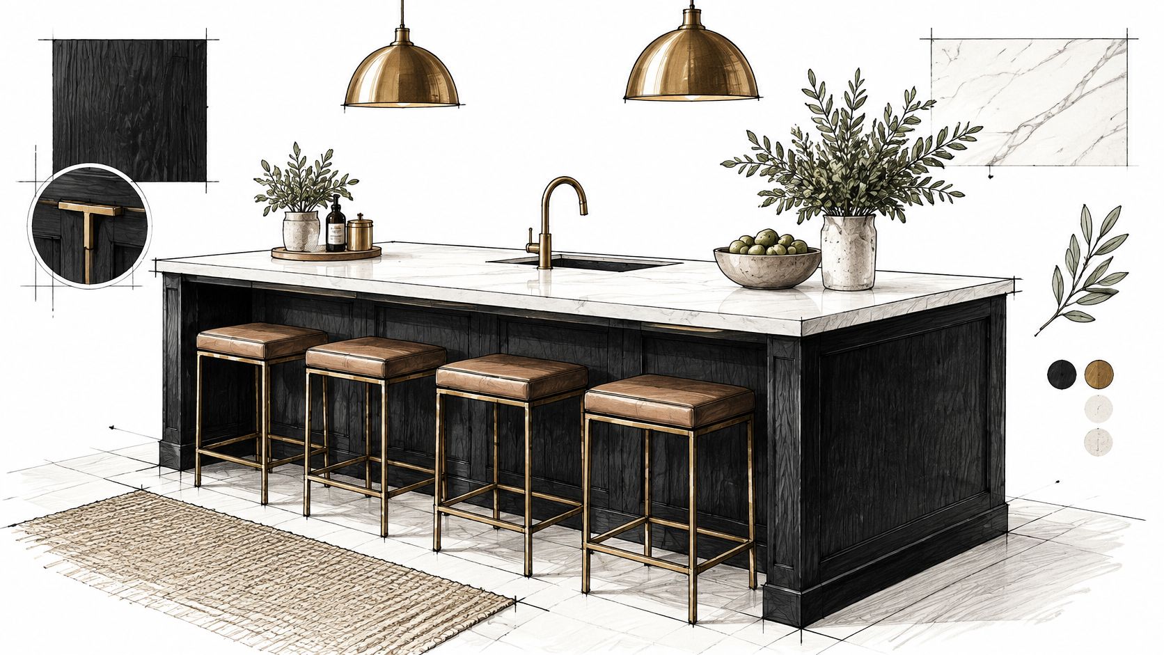
An ebony island surrounded by lighter cabinets can provide the contrast a kitchen needs without making every cabinet dark. Pair it with natural wood flooring, a pale countertop, and brass hardware for a strong but balanced look.
Ebony aims for black rather than dark brown, but the stain label doesn't guarantee complete opacity. A lighter application may leave grain and undertones visible, while a heavily pigmented finish can conceal much more of the wood.
Purdue Extension's wood-finishing guidance distinguishes solid-color stains, which can obscure natural color and grain, from semitransparent stains that allow more of the underlying wood to influence the result. For ebony cabinets, that distinction matters as much as the shade itself.
Decide How Much Grain You Want
Oak can retain visible pore texture even when the color looks black. Maple usually has a less pronounced grain pattern, so an ebony finish can look sleeker, provided the surface preparation is even.
Don't approve ebony solely because it looks black. Approve how much wood character remains visible under your kitchen lighting.
Place the sample beside your backsplash, then check it with overhead and under-cabinet lights switched on. A white marble backsplash can create crisp contrast, but a poorly lit cabinet run may lose its detail.
Use a compatible protective clear coat rather than treating stain as the wear surface. During our consultation, we review the existing cabinets and discuss your desired color, giving you a chance to consider ebony against the room's lighting and layout before committing.
3. Walnut
Walnut-toned stain offers richness without the near-black appearance of espresso. It can lean golden, reddish, or more neutral depending on the product and the wood beneath it, so compare actual samples rather than assuming every walnut label describes the same brown.
A walnut stain also isn't the same thing as walnut wood. Oak stained walnut retains oak's grain, while actual walnut brings its own natural color and pattern to the finish.
The 2025 U.S. Houzz Kitchen Trends Study found that medium-tone wood accounted for 18% of lower-cabinet selections among renovating homeowners. That makes medium-depth wood worth considering, but your existing flooring and trim should guide the final undertone.
Coordinate Rather Than Match Everything
Say you have oak cabinets, warm wood flooring, and soft white walls. A walnut-toned cabinet finish can work well if it's clearly deeper or differently toned than the floor, rather than almost matching it.
Try these comparisons during sample approval:
- Against the floor. Look for intentional contrast instead of an accidental near-match.
- Beside the countertop. Natural stone can contain small red, gold, or gray details that become more noticeable beside brown cabinetry.
- With hardware. Brushed nickel offers a quieter accent, while warm brass emphasizes the stain's warmth.
On raised-panel doors, inspect the recesses and frame joints for darker buildup. Bright daylight can make reddish undertones easier to see, while dim evening light may make the same sample look considerably deeper.
Our color approval process uses your cabinet doors, so you can judge those details before the full kitchen is finished.
4. Provincial
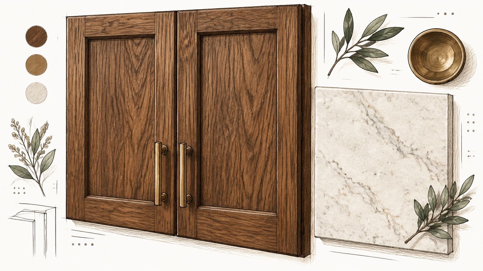
Choose Provincial when you want a warm, traditional brown rather than a crisp, cool finish. Depending on the formulation and substrate, it can read as a soft medium brown or show a stronger reddish-golden cast.
It suits a farmhouse-style kitchen with an apron-front sink and butcher block countertops. Provincial lower cabinets beneath cream uppers can also introduce warmth without making the entire room feel wood-heavy.
Oak and pine won't produce interchangeable results. Oak has pronounced open pores, while pine requires a different approach to absorption and preparation, as explained in Minwax's wood-staining guidance.
Watch for Too Much Warmth
Provincial can be inviting in a room that feels visually cool, but it won't brighten a dark kitchen by itself. You'll still need useful task lighting and enough contrast between cabinets, walls, and counters.
The potential problem is stacking warm finishes together. Provincial cabinets beside yellow-toned flooring, cream tile, and warm bulbs can look more orange than the sample suggested.
A satin clear coat is a useful starting point when you want gentle reflection rather than a glossy, furniture-like appearance. Test it on the same prepared surface you'll use for the finished cabinets.
- Use a representative area. A hidden patch helps, but a complete door shows grain changes and recessed details more clearly.
- Keep fixed finishes nearby. View the sample beside the countertop and flooring you're keeping.
- Inspect in mixed light. Check it when daylight and kitchen lights are both present.
We test and refine the color before full application, so Provincial can be evaluated as a complete finish rather than a promising color chip.
5. Cherry
Cherry stain gives cabinets a reddish, furniture-like warmth. It's a natural direction for traditional or Arts and Crafts-inspired kitchens, especially when paired with a cream backsplash and understated hardware.
The important distinction is between cherry-colored stain and cherry wood. A stain can suggest cherry's color on another species, but it won't reproduce cherry's grain, and natural cherry can deepen with age and exposure to light.
On oak, a cherry tone follows the bold grain pattern and may look more textured than expected. On maple, the color can appear smoother, but differences in absorption can produce dark patches unless preparation and application are controlled.
Test the Red, Not Just the Brown
Warm afternoon light can make a cherry-toned finish look more orange-red. Cooler light may subdue that warmth, so a sample that looks restrained at breakfast can feel much stronger later.
Minwax's wood-finishing basics explains that the final appearance depends on the stain, wood species, and how long stain remains before wiping, while end grain can absorb more color. Inspect door edges and frame joints along with the broad center panel.
Color-control advice: Evaluate cherry stain on a complete door whenever possible. The edges and joints can look noticeably darker than the face.
For a balanced layout, try cherry lower cabinets with white uppers and warm metal pulls. Wooden countertops can work too, but choose a contrasting wood tone instead of expecting different species to match.
Let the stain reach the required drying stage before applying a compatible clear coat. Rushing that step can disturb the color or interfere with the finished coating.
6. Honey Oak (Natural Golden Stain)
Honey oak doesn't have to mean a heavily yellow kitchen. A restrained golden stain can preserve oak's character while giving existing cabinets a cleaner, lighter-looking finish.
The familiar honey-oak kitchens associated with the 1980s and 1990s often combined golden cabinetry with several other warm surfaces. A more current approach separates those elements with white countertops, simpler hardware, and lighting that doesn't exaggerate yellow undertones.
Interest in natural-looking oak is measurable: 59% of respondents preferred white oak kitchen cabinets for 2025 in the NKBA report covered by Kitchen & Bath Business. That's a preference for a species, not proof that every golden stain is fashionable, but it reinforces the appeal of visible wood.
Keep the Oak, Control the Gold
Red oak and white oak can respond differently to a light stain. The existing wood color remains visible, and a clear coat alone may deepen or warm it more than you expect.
For a bright kitchen, consider honey-toned cabinets with white counters and pale flooring that has enough contrast to keep the surfaces distinct.
- Start lightly. Compare a clear finish with a lightly toned golden sample before choosing a stronger honey stain.
- Update nearby details. New hardware and better lighting can change how the existing wood reads.
- Test the complete system. Judge the prepared wood, stain, and clear coat together.
Our guide to planning a kitchen cabinet restaining project can help you consider the scope before choosing a finish. Keeping sound cabinet boxes is practical, but a lighter golden result still depends on what remains after the old coating is removed.
7. Driftwood Gray (Gray Wash Stain)
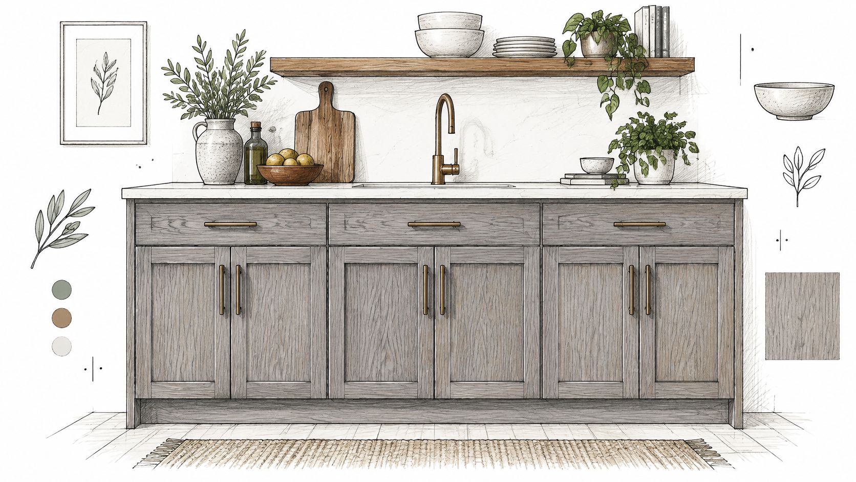
Gray wash works best when you want visible wood with quieter warmth, not the uniform appearance of gray paint. It can suit coastal, modern farmhouse, and transitional kitchens without making the cabinets look completely opaque.
Try gray-washed oak lower cabinets with white uppers and warm wood shelving. The shelving provides a warm counterpoint, while the stained cabinets retain their own grain texture.
Oak's pores can collect pigment and create pronounced gray lines. Maple has a subtler grain pattern, but uneven absorption can make a pale wash look cloudy rather than gently weathered.
Check for Blue, Green, and Beige Undertones
Gray stain over warm wood doesn't necessarily produce a neutral gray. The wood underneath may pull it toward beige, while the product's undertone and surrounding finishes can make it appear blue or green.
Cool daylight can emphasize that cooler cast. Warm evening bulbs may bring the underlying brown or gold back into view, which is why approving gray only under showroom lighting is risky.
- Compare nearby whites. Hold the finished sample against your backsplash and countertop, not a sheet of white paper.
- Add warmth deliberately. Brass hardware or natural shelving can soften a cool gray finish.
- Check the corners. Recesses and joints shouldn't look heavily stained while the door face looks barely colored.
Avoid trying to correct orange cabinets by wiping gray stain over an intact clear finish and expecting an even result. The old coating controls absorption, so preparation must suit the existing surface.
We prepare samples on your own cabinet doors, allowing you to assess the gray wash under your kitchen's actual lighting before approving the color.
8. Mocha (Chocolate Brown)
Mocha sits between walnut and espresso in depth, and it is the stain most likely to change character from one brand to the next. A manufacturer may describe it as a deep, cool-toned brown with a neutral undertone. The wood underneath can still pull it warmer or flatter. Maple keeps the color quiet because its grain is tight. Oak pushes more texture through the finish, and the same mocha can look lighter on a door face than on a drawer front where the grain runs another direction.
Mocha cabinets pair comfortably with white quartz countertops and warm wood floors. On an island, the shade gives a light kitchen a darker focal point without the sharper contrast of ebony. It can also feel cold or flat in a dim kitchen, especially when cool daylight is the only light source. Warm evening bulbs bring the brown back into view.
A kitchen-design report covered by Kitchen & Bath Design News found that 73% of surveyed experts expected mixed wood-and-painted cabinetry to be the leading trend. That is a design-industry expectation, not a requirement, but it supports considering a stained island alongside painted perimeter cabinets.
Don't Stain Over Paint
Previously painted cabinets need special evaluation. Penetrating stain won't travel through paint to color the wood underneath, and removing paint may reveal repairs or mixed materials that don't stain evenly.
Our wood stain versus paint guide explains the practical difference when you're deciding whether visible grain or uniform color matters more.
Test mocha in daylight and under evening task lighting. If it turns too gray beside your flooring, compare a warmer chocolate sample rather than relying on brass hardware to correct the entire palette. A sample finished on your own cabinet door is the useful test, because a fan deck won't show how oak or maple takes the brown. A satin clear coat gives mocha a soft reflection, but consistent sanding and controlled application still matter most for even color. Check drawer fronts alongside doors, since different grain directions can make the same finish appear lighter or darker.
8 Kitchen Cabinet Stain Colors at a Glance
Treat this table as a starting point for sorting color families. Oak, maple, and cherry take the same stain differently, and your kitchen light can shift every tone.
| Stain Color | Tone & Undertone | Grain Visibility | Best Kitchen Style | Watch Out For |
|---|---|---|---|---|
| Espresso | Very dark brown, slight warm undertone | Visible on open-grain woods | Traditional, transitional, modern farmhouse | Can close in a small or dim kitchen; dust and fingerprints show |
| Ebony | Deep black that can look opaque when heavily pigmented, with grain showing through lighter applications | Mostly obscured when heavy; visible on lighter coats | Modern or contemporary, especially high-contrast kitchens | Shows dust, fingerprints, and scratches; can feel heavy without good lighting |
| Walnut | Medium-dark brown with warm, reddish undertones | Highlights natural grain and texture | Traditional, transitional, mid-century inspired | Can look muddy if uneven; leans red or orange |
| Provincial | Warm reddish brown | Clearly visible on oak, softer on maple | Traditional, farmhouse, country | Red undertones may clash with cool finishes; can look dated in modern kitchens |
| Cherry | Warm, glowing reddish brown | Brings out natural wood tones | Traditional or Arts and Crafts | Can look overly red; color may deepen over time |
| Honey Oak (Natural Golden Stain) | Light golden brown with warm undertones | Strongly highlights oak grain | Modern rustic or farmhouse | Can look dated or overly yellow; shows minor flaws |
| Driftwood Gray (Gray Wash Stain) | Soft, weathered gray | Visible through the wash | Coastal, modern farmhouse, transitional | Can look dull without warm accents; results vary by wood species |
| Mocha (Chocolate Brown) | Medium-dark chocolate brown with restrained red or golden undertones | Visible while retaining a rich look | Contemporary or transitional | Can look flat if the undertone fights your flooring; may show dust and wear |
Read the grain and watch-out columns before you fall for a color name. Oak shows Provincial and Honey Oak strongly, maple softens them, and a gray wash is the least predictable across species. Your kitchen light decides whether mocha reads warmer or flatter.
Ready to Pick Your Stain? Test It on Your Own Cabinets
The right shade depends on your wood species, grain, existing finish, and lighting. Espresso may look rich on oak but almost black on another surface, while a gray wash can look neutral on a sample board and unexpectedly cool in your kitchen.
The most reliable approval sample is a properly prepared section of your own cabinetry, finished with the intended stain and protective clear coat. A loose board in the same species is helpful for narrowing choices, but your cabinet door reveals the actual grain, prior finish history, and construction details.
What a Useful Sample Should Show
At RMK Contractors, we begin with a consultation to examine your cabinets, discuss the color you want, and answer questions. We prepare samples on your cabinet doors and refine the tone before continuing with full application.
Your sample should help you evaluate more than whether you like brown, black, gold, or gray:
- Color across the door. Inspect the center panel, frame, edges, and recessed details.
- Sheen in direct light. Look for the amount of reflection you'll be comfortable seeing every day.
- Coordination with fixed surfaces. Compare it with flooring, countertops, backsplash, and trim.
- Appearance throughout the day. View it in natural light and with your usual kitchen lights switched on.
Changing dark cabinets to a lighter stain deserves particular care. A lighter stain won't erase a darker one, so the existing finish and color must be evaluated before anyone promises a pale result.
Plan for the Finish, Not Just the Color
Preparation, coating compatibility, ventilation, and curing all belong in the conversation. The U.S. Environmental Protection Agency's indoor-air-quality guidance notes that paints and coatings can emit volatile organic compounds during and after application, so lower-emission products still require sensible ventilation and application planning.
Dry to the touch doesn't necessarily mean ready for normal cleaning or hard use. Follow the finishing system's cure guidance, and avoid choosing a return-to-use date based only on whether the odor has faded.
We serve homeowners in Austin, Round Rock, Cedar Park, Leander, Pflugerville, Georgetown, and Lakeway, with attention to consistent color and finish across doors, drawers, and cabinet boxes. Bring your preferred shades and the details you're keeping, and we can discuss a practical direction and provide a free estimate without pressure.
RMK Contractors offers cabinet refinishing and restaining to help you change the tone of your kitchen while preserving the wood character you enjoy. Visit RMK Contractors to request a free estimate and discuss stain samples on your own cabinet doors before choosing your final color.